The Rise of Biking in D.C., Visualized
November 16, 2015 // as featured in Washington City Paper
Each year, on a weekday without rain sometime between May and July a person stands at the exact same spot from 6am to 10am and again from 3pm to 7pm. They’ve been sent by D.C. Department of Transportation, and they count bikers. In my six years in the District I’ve seen the rapid rise of biking from niche transport to a commonplace commuting option. DDOT’s bike counters put numbers behind that change. The number of bikers may vary on any given day, but when looked at over time it can illuminate how bike ridership has changed across time and geography in the District.
These counts show that bike ridership has more than doubled from 2008 to 2014. But growth isn't the same across the city. The map below shows the thirty-seven DDOT bike count locations, colored by the number of riders counted in the eight-hour time period. Click on a location to see how ridership has changed over time and how it compares to the median of all count locations.
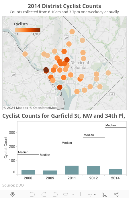
All but one of the locations experienced increases from 2008 to 2014, and in over half of the locations the cyclist count more than doubled. Cyclist growth varied dramatically across locations, with some experiencing more than three-fold increases and others relatively static.
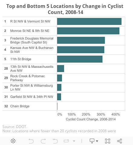
The top five locations show the increasing popularity of bike lanes. A bike lane was added to Monroe St in 2008. Bike lanes were added to R St NW and Kansas NW even earlier. While bridges connected to Arlington have always seen the most cyclists, increases in bikers on bridges to and from Anacostia suggest it’s becoming a more important connection point to cyclists. The majority of the slowest growing locations are in upper NW, a wealthier, older, and more suburban part of the city.
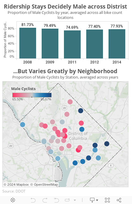
What do the counts say about who is riding? The gender of cyclists in the District has stayed decidedly male from 2008 to 2014, with only a slight decrease in the proportion of male cyclists. While men are the majority of riders across the District, their proportion differs greatly across the District. In parts of Capitol Hill and Northwest men were only two-thirds of cyclists, while parts of Northeast saw as much as 98% male cyclists. Locations that included a bike lane were also more likely to have more female riders.
The map below shows the average proportion of male cyclists for each location for years of data collection. Click on a location to see more detail.
A recent HackShopDC visualization shows bike accidents dramatically increasing from 2006 to 2013. It may look more dangerous, but without the context of total cyclists over time the relative danger can’t be determined.
In fact, comparing the how the number of cyclists and bike accidents have grown over time shows that the city is getting neither more dangerous or safer for cyclists. Both grew 80% from 2008 to 2012. It is encouraging to see the city is not more dangerous for cyclists today, but given the many DDOT initiatives and growing awareness of biking one might have expected greater safety gains.
Technical notes: Graphics are based on DDOT Bike Count data. Bike counts from 2010 and 2013 are not shown because of insufficient data collection. You can find complete code for this post on my github page.